Thursday 30 June 2011

Tracey Emin: Love is What You Want


"Art is an extended act away from the being, art is something else. Not everything can be art, and just because you're an artist doesn't mean everything you touch is art. You have to decide and know what is art, and you have  to be separate from yourself."

-Tracey Emin -1st August 2009-

Well said, Emin.

The problem with contemporary art nowadays is that it can be irritatingly quotidian, or wants to draw attention to itself or it comes with an invisible 'SHOCK HORROR' banner. As are the Tracey Emin's works: exposed and autobiographical. As Emin so eloquently said 'Not everything can be art', how can we approach her works as pieces of art?

Her recent exhibition at the Hayward Gallery, 'Love is What You Want' spans through every aspect of her artistic career, exploring all media; paintings, drawings, memorabilia, needlework, photography, neons, films, expressing a spectrum of sentiments resulting in an equally wide spectrum of works.Works which of course have a sprinkling of her light-hearted playfulness, ironic wit and frank nature:

My natural childish impulse meant that I found myself sniggering in the dark corridors where these were displayed...with other people. Neon has its seedy parallels, but our Tracey finds them 'sexy' and 'pulsating'.


Questionable is her section about her abortion, in which she openly talks about the procedure, her thoughts on motherhood in 'How it Feels' of 1996. This provides the sugar coating to the 'memorabilia' around it; her used tampons in particular (though shrivelled they are) saw many wrinkle their nose is disgust and disapproval (I chuckled again, obviously.)

Film - Why I never became a dancer
The films cover themes of tragedy and comedy, (see above, 'Why I never became a dancer' of 1995, shows her free-spirited dance after recalling being rejected for dancing. The music in her low-tech videos play a key part.

Wild, public drunkard though she may be (or was now, I believe Emin has shed her skin) Tracey Emin does heavily consider what people think of her (yes, SHOCK-HORROR), although most of the time it appears she does not take herself seriously. She is, vulnerable and longing and motherly; something I discovered in her section on abortion. She's not what we all thought.

Wednesday 29 June 2011

I am angry. The BP Portrait Award @ The National Portrait Gallery (Unfinished)


I confess I've never been to the BP Portrait Prize before, and from all its high praise and esteem from those who have been and told me, I had this preconception that it would indeed be this shiny and mind-blowing exhibition.


'Just to Feel Normal', Ian Cumberland

In 3rd place was Ian Cumberland with 'Just to Feel Normal'. I am amazed at the utter honesty in which Cumberland decided to paint in. It's incredible: every facet, every surface goes unmissed, the man's face is strangely illuminated in a sickly silvery light which give his skin a veiny, marble effect. His exhaustion takes shape in the form of two orange patches around his asymmetric eyes. In effect, this portrait shouldn't work aesthetically, but with its honest hyper-realism, it does. It works so well.

The runner-up was Louis Smith

W/ the altarpiece framing

'Holly', Louis Smith

What an innovation! This 8ft canvas (altarpiece?) shows the recreation of the story of Prometheus, who was bound to a rock after stealing from Zeus and left to be eaten to death by an eagle. The model here looks up at the supposedly approaching eagle with a calm submission. She is depicted beautifully with a similar chiaroscuro to Caravaggio's dramatic paintings (although not as dark and plenty of contextual background). The crowd was always -surprisingly- flocked around this particular painting. 

And the 1st prize:

'Distracted', Wim Heldens

I am so angry. Well, more disappointed. It took me forever to find this painting, and after seeing a sharp crescendo in Cumberland and Smith's work, I was expecting 1st prize to surpass them (I am not saying however that it needed to be so inexplicably amazing). Frankly, this is a portrait that I would walk past, in fact, I almost did on the way out, had it not been for the loud orange sign. In its defence, the curating did not help; as a visitor, I would have liked a more linear procession towards the 1st prize, and that would have been satisfied if this was placed in the back room. It's predictable, I know. But let's face it, predictable works. Instead it was placed on the most obscure wall near the front.
To balance out my negativity, it does have a nice context; Heldens is depiciting 25-year-old Jeroen, Helden's father figure. The NGP's director and chair of judges stated his work was 'a quiet but evocative study'. Yes, after standing in front of it for half a minute, I did feel a sense of quiet dignity and childish pride for someone they admire creep in. Quiet confidence is always a dark horse. I feel a little guilty now. But only a little.


Thursday 5 May 2011

Gilded Romance vs. Eroticism and Sexuality: The two sides of Gustav Klimt

Klimt is one of my favourite artists; and I think it's a feminine thing. Let's be honest - I have yet to come across a girl/woman who doesn't love him!
There's something about his golden canvases that draw in women like magpies to a shiny objects; they are mesmerising, higly romanticised, sensual - particularly because most of his subjects are women. Maybe that's why women love his paintings; they can relate to them, identify with them.
Water Serpents II c. 1907

Judith and the Head of Holofernes, 1901
But little did I know about his drawings of male and female nudes and sexually inspired themes:


"Several of the works, including two of women masturbating, would be hard to hang on a domestic wall. "They were made for the artist's pleasure, and kept for the collector's private pleasure," Mr Pylkkanen said. Some of them are preparatory drawings for known paintings, but most are works in their own right. They include a coloured chalk drawing of Ria Munk, a Viennese society beauty. Klimt painted her several times, completing a portrait that was commissioned by her parents, and another of her lying on her death bed - made in 1912, a year after she committed suicide at the age of 24. "
(The Guardian, 10th October 2001)

Indeed, Klimt has addressed the taboo of sex and pleasure quite clearly; these works are exposed, striking. The exquisite delicacy of his execution he conveys, better than any other book, that image fragile and complex, but deeply expressive, that Klimt built of women, their theme par excellence.

Louisa Chase/Disney's 'Fantasia', 1940/The Futurists/Kandinsky

What do they all have as common ground?
Music.

I'll explain in the form of a flow chart:

LOUISA CHASE, 'EMERALD SEA'
(photo from book)
I described this painting as an 'orchestra of colours and marks', which then led me to...

WALT DISNEY'S 'FANTASIA' 1940 (FILM STILLS)

Galaxy


Violin bows
The orchestra in this selection of stills (the rest are in my book) are visualised through similar marks found in 'Emerald Sea' - franticly organised, like the notation of music itself.
This then led me to...

FUTURISM: 'MUSICA', RUSSOLO

Like musical notation, the orthogonals are almost like staves, ribboning and meandering across the canvas in the form of a blue line. The title 'Musica' is so called because Futurists were obssessed and gripped by the notion of evoking sound in their paintings.
This finally led me to...

'IMPROVISATION 28', KANDINSKY

Kandinsky was also known for his interest in combining music and art: it is no wonder why his pieces like 'Improvisation 28' were also called compositions. Kandinsky is one of my favourite artists because of this (as a musician), his works are almost like graphic scores, bursting with a sensation of freedom and deep expression.

My Kandinsky page (from Guggenheim gallery page, part of New York pages from my book)

RCA Workshop: Helen Murgatroyd, 4th February 2011


"Inspired by Royal Mail sorting offices, kitchen utensils and the ideals of cottage industries, I invent tools and workstations to allow the duplication of my drawings. Motivated by a search for self-sufficient printmaking my practise combines the home kitchen with the print workshop, attempting mass-production on a domestic scale. Repetition is my subject yet the humanness of the processes I invent ensures that each picture is unique. I am interested in the space between drawing and printmaking where editions of one-offs are a possibility.
My practice is driven by a compulsion to make, while being firmly rooted in observational drawing."

----->  http://www.helenmurgatroyd.co.uk/

Helen's low-key method of printing goes to show that you don't need state-of-the-art, artsy-farsty, wishy-washy technology to get down-to-earth, great-looking prints. In fact, doing it with your own hands is more satisfying than to have a machine laser-cut it out for you.
We started out with quick, 10-second sketches of batches of vegetables to base our prints from; it was 'go, go, go' from the second the charcoal glided onto the paper. Then, using card, cardboard and some stanley knives, VOILA: in about 15mins we were ready for printing.
Printing = pressure via hands. It was great.


(Based on an onion), making the print board

Testing prints

Combination prints: joint with the prints of two other people

(from left to right) Me, Indy and Suzanna w/ our composition 


April 2010
'French bar', April 2010, Helen Murgatroyd
'Fruit bowl' , Helen Murgatroyd


'Teapot', Helen Murgatroyd

Dec 2009
'A tool made for duplicating an image of a bowl of fruit. Made of a series of removeable templates and instructions the image is built up colour by colour.'
Helen Murgatroyd

Tuesday 3 May 2011

The Big Apple, April 2011

So on 4th-9th, I went on an Art History trip to NYC with Westminster School.

Never has the phrase 'words cannot describe' rung more true about New York. I mean it's one heck of a city - bearing in mind we only stayed in Manhattan (sad face).

So, if I can't describe, I take photos. I figure I can share my experience so much easily through visuals.
I took my film Canon, and I only had 3 rolls (do the math: 33 x 3 = 99, but I still haven't developed the last roll).

(It's no where near enough to capture the atmosphere of New York, but hey)


Here's a selection of some bits (unseen in the book):

Dr Cockburn with Rodin sculpture @ The Met

The Met

Mr Street with a de Kooning @ The Met

The Met

Times Square


*Law and Order theme tune*

It's fun to stay at the YMCA


MoMA

Lil bit o' Duchamp@ MoMA

Drawing in Central Park

Signpost in SoHo

Thursday 6 January 2011

Process Painting in Pictures, Part 2

This is a second colour study for a photograph I took at the Natural History Museum.
I was influenced heavily by Leonardo DaVinci and his anatomical studies, and I focused on the anatomy of birds.

Still unfinished, but bear with me:


Wednesday 5 January 2011

Review Comparison – V&A: Diaghilev and the Golden Age of the Ballets Russes 1909 -1929 and Tate Modern: Gauguin, Maker of Myth


It has been a century since these leaders in innovation were at their primes; each bringing forward artistic rebellion in their differing art forms.
Gauguin’s last retrospective in London was 50 years ago; he was then seen as ‘Gauguin the savage’, a notorious artist of the 19th century whom which people referred to him as ‘the artist that goes to Tahiti’, enthralling the local young Tahitians, living the life of paradise he always sought after. But fast forward a 100 years later and Gauguin is seen as a hero, if you like, the 20th century artist’s liberator; artists benefit from his legacy and many of the –isms of art in the 20th century, for instance Primivitism and Symbolism owe it to Gauguin for that artistic freedom. He adopted a ‘right to dare policy’, he abhorred restraints in civilisation, renouncing and defying the notions of traditional Western art. He argues that art should go beyond material appearances, developing a simplified visual language to explore complex ideas and construct poetic meaning.
Travelling to the remote corners of the world, Gauguin was worldly-wise, cultured and cultivated; having travelled and lived in South America – Peru – for the first four years of his life, the country whose colourful imagery was to influence his later works. One of his early works from Martinique, Tahitian Landscape, 1893 for example boasts an intense symphony rich in colour and a non-naturalistic palette. Coloured in vivid greens, mauves, yellows and oranges; the simplified shapes and keen colour portray his idyllic landscape, dissimilar to the pictographic terrain of Pont-Aven, with its rolling hills and an atmosphere seemingly untouched by time.

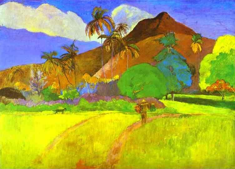
'Tahitian Landscape', 1893
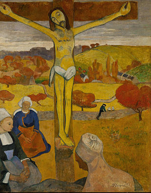
'Yellow Christ', 1889
Out of all the Impressionists, Gauguin was undoubtedly the most flamboyant and intelligent. Although he rejected religion, a lot of his works have religion as a feature. The heady fierce colour and strange symbolism that hallmarks in Yellow Christ of 1889 depicts a the crucifixion of Christ on the rolling Breton hills of Arles; the autumnal palette brags the autonomous yellow of his flesh – perhaps an influence from having lived with Van Gogh -  which is then resonated in the landscape behind. The limited depth of the figures and bold outlines are typical characteristics of cloisonnisme.
Equally lurid were his hand-carved lintels which he made as an entrance to his bedroom, in which he carved the inscription: ‘Maison du Jouir’, translating to ‘House of Pleasure’. A confrontational message, which proved to provoke particular neighbours (Catholic bishops).
In the heart of the exhibition, it’s impossible to miss the one painting that continually attracts a mass of people like moths to a flame. The famed figure of a pensive Tahitian girl reclining on a bed – inscrutable Nevermore O Tahiti, 1897, bearing references to Edgar Allan Poe’s poem The Raven and a physical presence of the raven itself perched on the window. The otherwise dimly tinted canvas, shadowed by the omen that is the raven is kindled by her bright shoulders and a favourite of Gauguin’s – the jovial yellow of the pillow. The sensual, seductive contours of the woman are echoed in the frame of the bed and for a moment there is a slight hint of irritation in her expression.
'Nevermore O Tahiti', 1897
The show promised to be one of the most anticipated exhibitions at the Tate for 2010, and the Tate has succeeded in delivering a coherently curated exhibition. Eleven rooms are cleverly divided thematically and chronologically; the opening gallery consisting of a progression of self portraits from both Paris and Tahiti. It becomes plain to see how Gauguin can be so adaptive and responsive to his surroundings. As you snake around the rooms, one gains a sense of Gauguin breaking bonds with the microcosm of the Western world, as he attaches himself to Tahiti, he distances himself geographically and thematically; people viewing him as something ‘other’, exotic, but not a term said with some distance. This is a brilliant show, shedding new light upon Gauguin and illuminating his intelligence and the way he incorporated his ideals and thoughts fearlessly onto canvas.
Diaghilev the patron, the dictator, the innovator founded and united the art forms in his Ballets Russes and the greatest artistic minds of the 20th century. His undisputed greatest achievement was his dance company the Ballets Russes, radically transforming the nature of ballet, its subject matter, choreographic principles, music, set design, costume, nurturing some of the greatest dancers, and bringing together forward looking composers. The Ballet Russes seemed immersed, obsessed even in experimenting, exploring new potentials and horizons for ballet.
The exhibition takes the time to consider individuals and related collections. A lofty curtain hangs conspicuously, spanning from the ceiling to the floor; the towering coral-rose female characters, caught in motion serve as hints to those to look up in awe of the magnitude of the stage. This was the work of Picasso, who painted the drop curtain for the ballet Le Train Bleu from 1924. This is a new horizon Picasso, who by then was deep in the realm of cubism, diverting into the playfulness of decor. Le Train Bleu also saw the works of Chanel, having the dancers sporting shift-dress-like bathing suits.

The curtain for Le Train Bleu, 1924

Costumes for Le Train Bleu, by Coco Chanel
A large section focuses on Nijinsky, to which the Ballets Russes had to thank for his unusually pioneering choreography. A video containing extracts from Pina Bausch’s choreography to Stravinsky’s Rite of Spring saw a new urgency in the dancing; the female solo pulling herself across the stage, the sheer tension on her face, while idle individuals around her suddenly come to life, equating their actions to the sharp bends in the music.
Costume design discovered new spheres as the traditionally tight fitting costumes of ballet were replaced by the likes of looser, heavier and decor elaborated attire influenced and infusing the old and new together; 18th century luxury and 20th century novelty. Surely, the weight of luxury-encrusted costumes would hinder the dancers? That may have been, but there is no indication of such problem when viewing the photographs of Nijinsky suspended in the air, performing one of his renowned jumps.
With the many rooms in this exhibition and the crossing between visual art, dance and music, it’s hard not to feel like a spectator attending a very complete show, what with its elements of projection performance; edited extracts of Stravinsky’s Firebird and other productions, glittering costumes on rotating plinths and an incredible ambience, it’s all like a production itself. There’s something there for everyone, a fabulously all-in-one show.